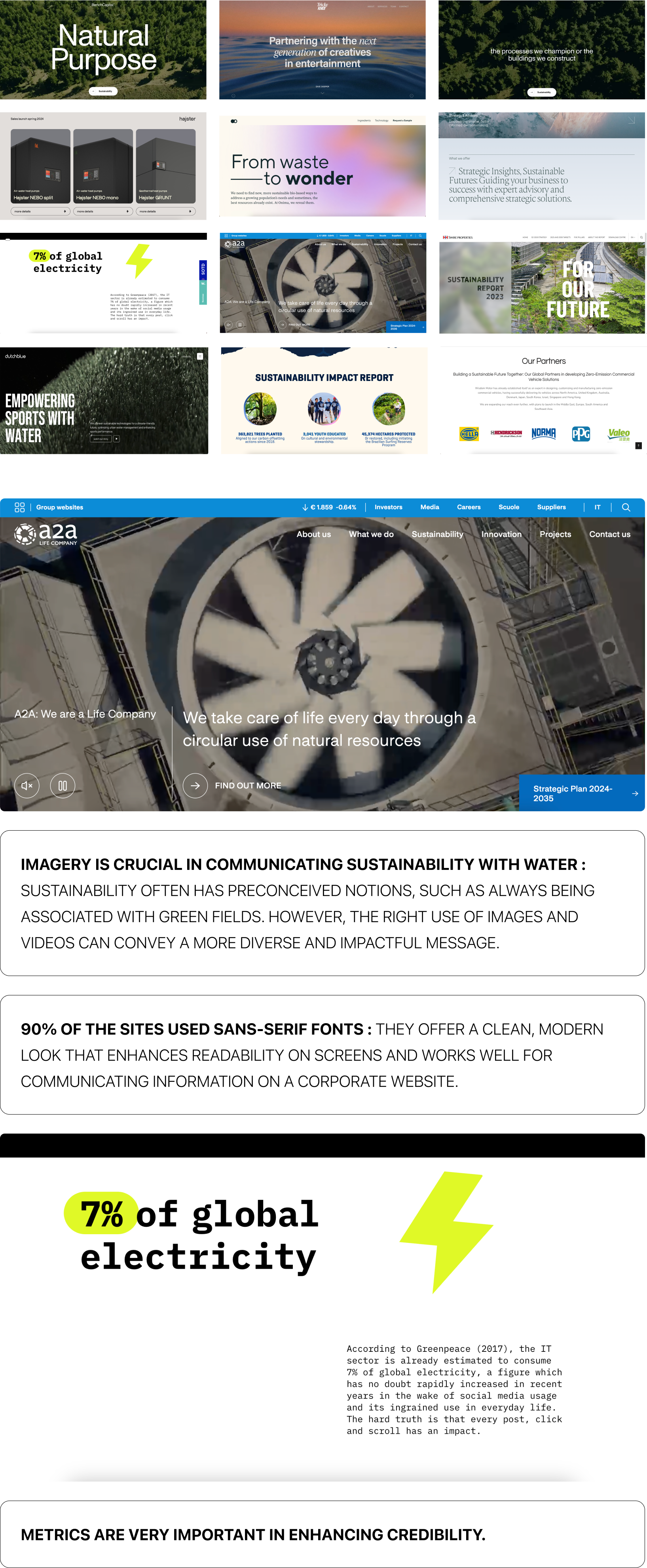
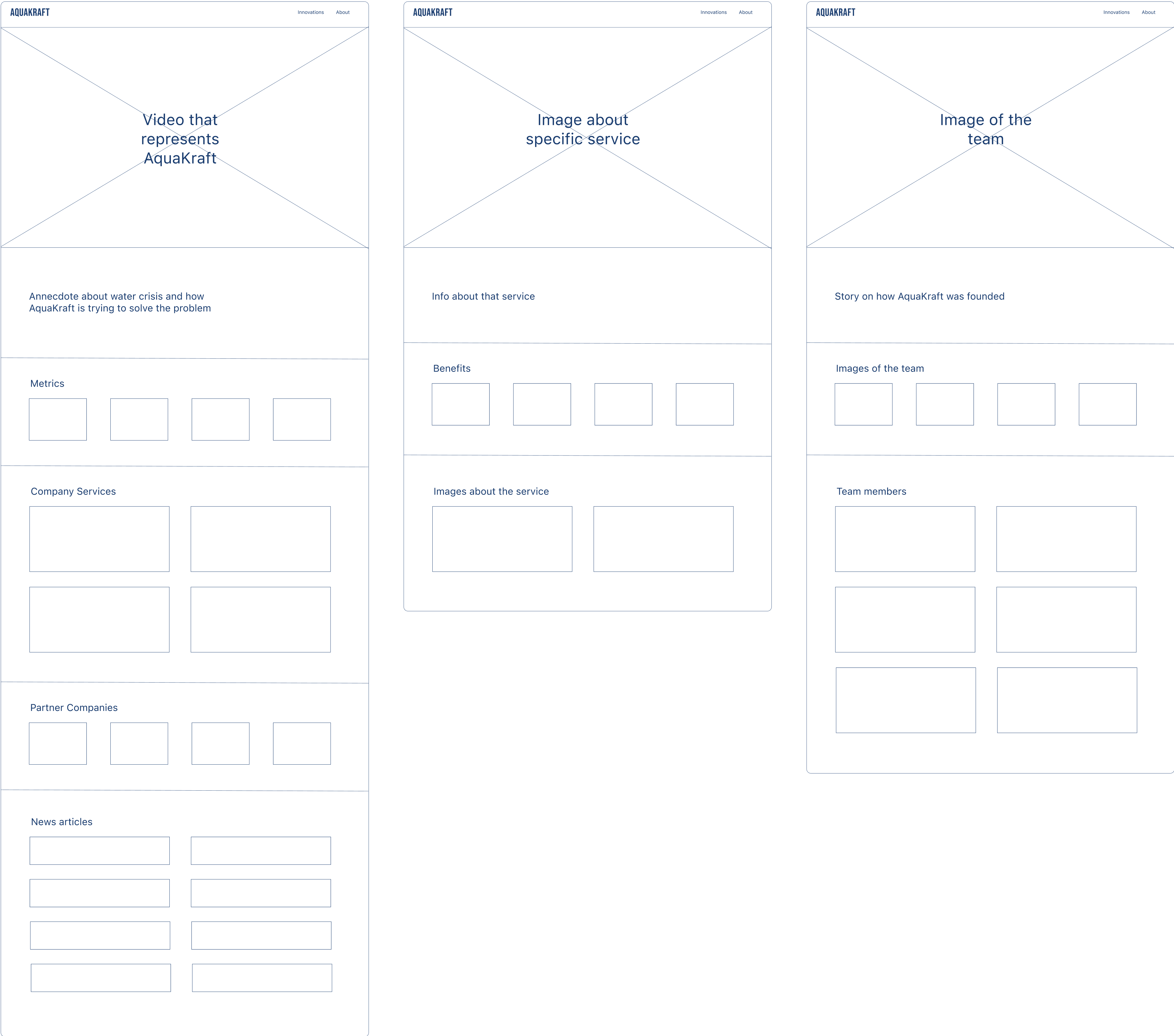
In June 2024, I was tasked with redesigning AquaKraft's website to
improve its user experience and overall functionality. My focus was on enhancing the site’s
design to better communicate AquaKraft’s mission, improve navigation, and create a more
user-friendly interface. This involved working closely with stakeholders to ensure the new
design aligned with the company’s goals and the needs of its users.
Team:
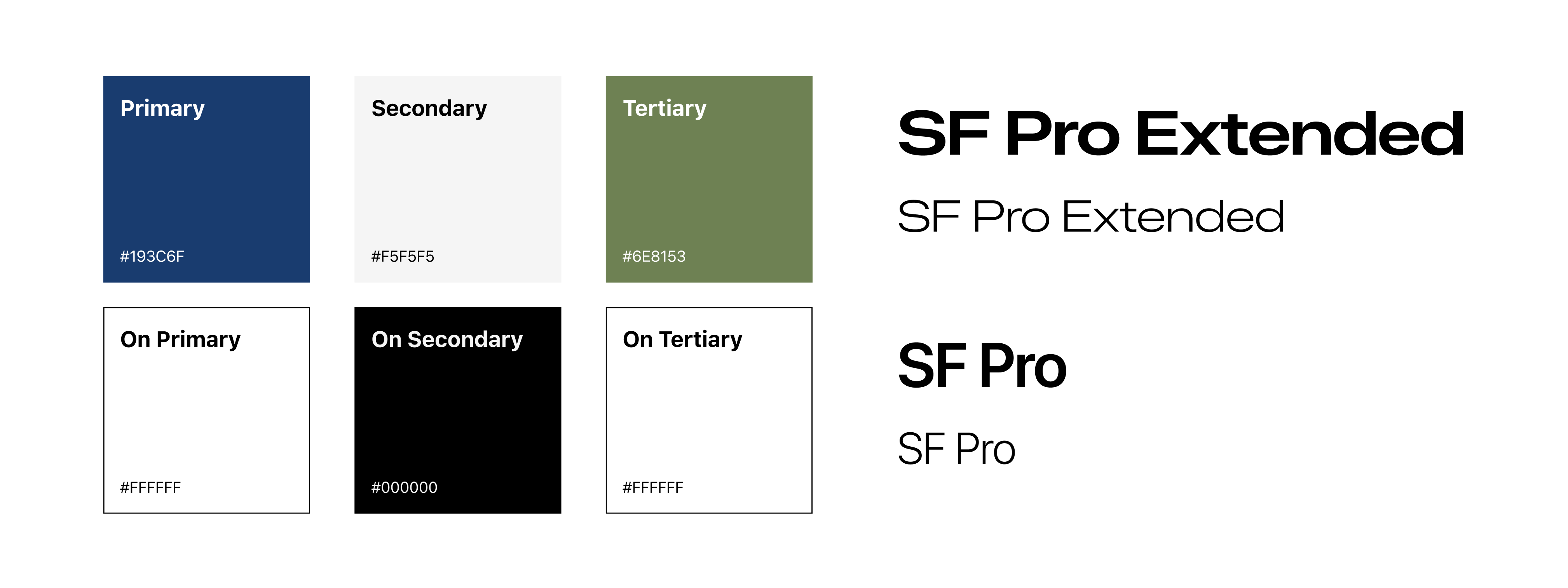
AQUAKRAFT
My Role:
UI DESIGN
UX DESIGN
VIDEO POST PRODUCTION
Tools:
FIGMA
SLACK

 Another constraint was the tight 4-week timeline, as the company aimed to launch the new
website before attending a UN conference. This required working in a fast-paced environment, making stakeholder
management crucial for clear communication with the C-level team, product manager, and marketing team. To ensure
efficient communication and gather insights, I scheduled weekly meetings and streamlined the process. Additionally,
I initiated a Slack channel for ongoing communication and quick responses when needed.
Another constraint was the tight 4-week timeline, as the company aimed to launch the new
website before attending a UN conference. This required working in a fast-paced environment, making stakeholder
management crucial for clear communication with the C-level team, product manager, and marketing team. To ensure
efficient communication and gather insights, I scheduled weekly meetings and streamlined the process. Additionally,
I initiated a Slack channel for ongoing communication and quick responses when needed.